I recently published Part I of my illustrated story course on beginner genetics. Then I thought it would be fun to discuss how I came up with the illustrations, so here are my thoughts ramblings on making the illustrations. Or maybe they’re on making the course in general. I’m not quite sure.
Initially I wasn’t sure if I should jot down key illustrations first and then write the copy for them later. After much back and forth, I settled upon doing the copy first so I could have some solid ground to build the illustrations upon. It was my first time trying to illustrate something like this, so I felt like that could help some.
The downside to this though was arranging my copy so it could be easily broken into smaller portions for the slides. My writing usually is rambling and long-form - I am aware of that, despite my blog continuing to present such writing - so keeping it concise and to the point was hard. Finding the happy medium between being descriptive enough and not overexplaining was another challenge.
I am prone to overexplaining and rambling, apparently.
In the end I did figure the copy part out, and while having illustrations planned out beforehand might have helped me with writing it out in an easily divided form, I think writing first was the better choice in the end… Which I discovered very quickly when I set out to start the illustration part.
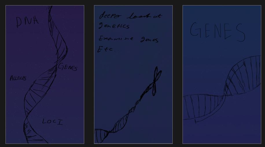
After basic setup was done, I started with sketching - just loose and rough, figuring out the shapes and composition. I also jotted loose text alongside, referencing my copy so I’d know what parts go where when I came to that stage. (By loose text, I mean borderline illegible. Just so that is clear.)
For the first three slides I had a clear idea on what I wanted, so those were quickly sketched and moved past. In fact, this mental image was so clear that it floated in my mind the entire time I worked on the copy, tempting me to ditch writing and illustrate these first. I am surprised I made it through the entire copy without giving in to the temptation.
Anyway, this period of enlightenment did not last very long, and I was brought back to reality when faced with the fourth slide. The cover was out of way. Now what?
I turned to the copy. Pored over that section for ages, willing good illustrations to present themselves in my mind. Of course, that didn’t help. So I dragged myself back into Photoshop, picked up the pen, and started doodling.
… yeah, I’m very organised. And methodical. Totally.
But in the end, some doodling got me going at least, and I threw done a rough sketchy chromosome. This felt incomplete so I added DNA compressing itself into the chromosome, with the mental note to make it shiny. I made everything shiny, actually. Part of the whole visual style I wanted for this, except I didn’t quite figure this out then.
Then I had a major back-and-forth moment again with the fifth slide. I wanted to portray actual information - something so far ignored, in the earlier slides - without it becoming too detailed or distracting. This part came in a bit later, because my initial sketch had a tiny cell, then a fancy lens icon zooming in and showing the nucleus. It worked in sketch form - but you’ll see the final is significantly changed. I’ll get to that later.
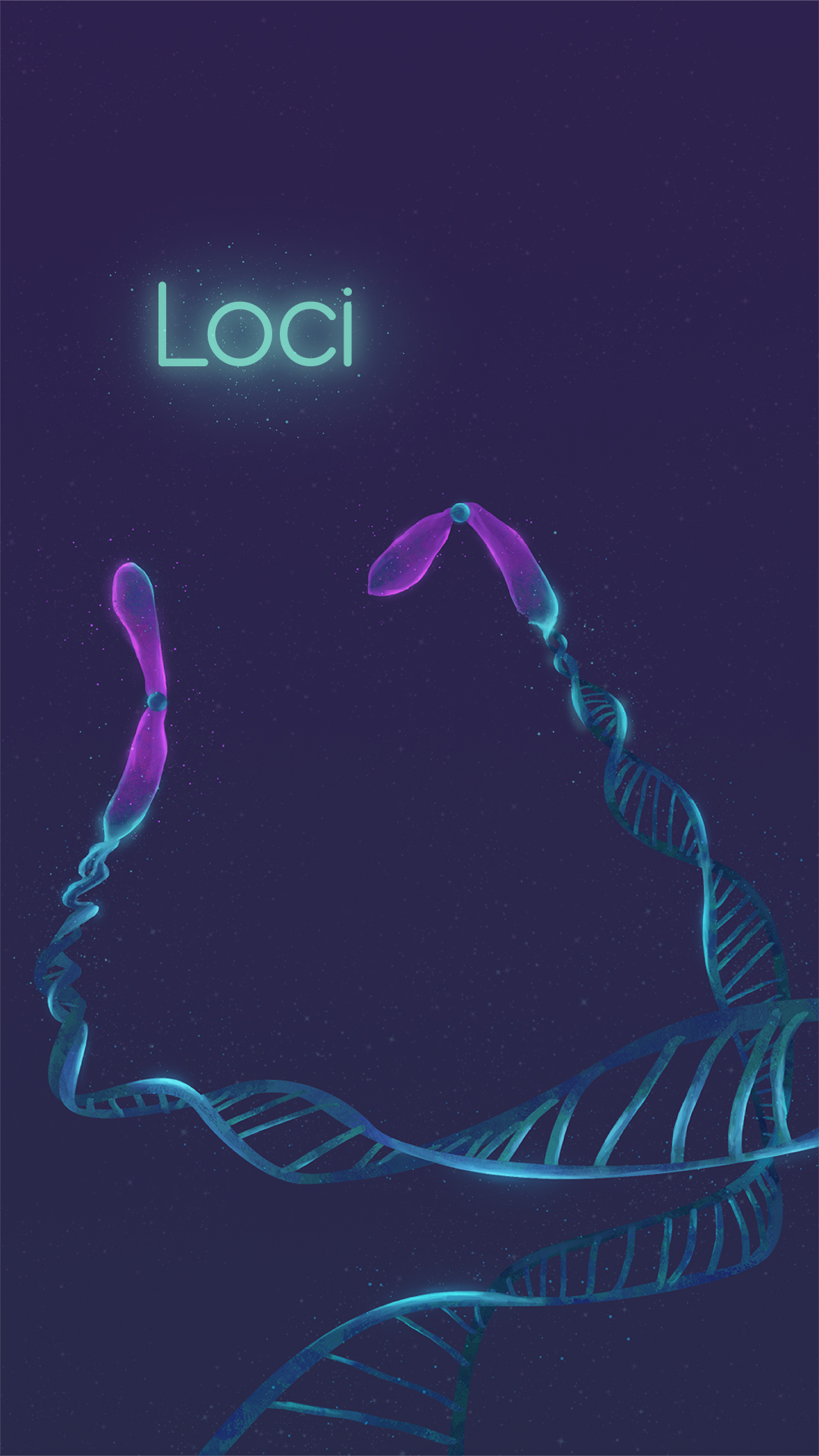
The next slide made me pause - once again - this time, because it was more text-heavy and had little I could illustrate. At least, little I could explain easily via illustration - this part needed to go down in text. Then it occurred to me that chromosomes in popular media are always depicted in the same stage - that is, just before they replicate.
(I do not know where this notion came from, by the way - chromosomes do not spend all their lives looking like the one in slide five. Somehow this has become the common, widely accepted notion and it serves as the root cause for so much confusion.)
This thought, of course, had little to do with the problem at hand - what illustrations should I put there? But for once, my errant thoughts were not entirely useless, and I figured I could just make some more chromosomes, keeping these one in the less-presented form - chromosomes in their normal state, not about to replicate.
So I smattered in some chromosomes, and even tried to keep them in pairs, trying to imply the concept the text explained.
I could go on covering every slide… but really, that’s not what I had in mind for this post. So let’s shift perspective and take a more overarching view of what I considered in every slide.
Composition
I think this was one of the most important - and the most tricky - part of these illustrations. Given my intended audience would be viewing it as either Instagram stories or web stories, I wanted to make the composition flow nicely from top to bottom when viewed individually, and also have each slide lead nicely into the next when viewed in succession.
I wanted dynamic, fluid illustrations - using them to guide the eye around the frames, leading from text to text and to the next images. It was interesting figuring out which elements must go where, and how to get the illustrations to both explain and serve as compositional tools.
In the end I think I achieved my goal, mostly. There are some slides towards the end where they served a whole lot less as visual aids, but I think those required more explanatory illustrations. So long as they didn’t negatively affect the composition, I decided they were okay.
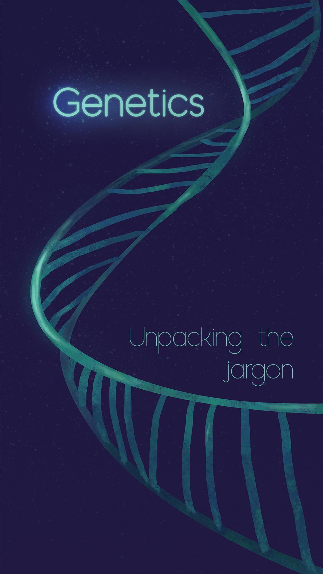
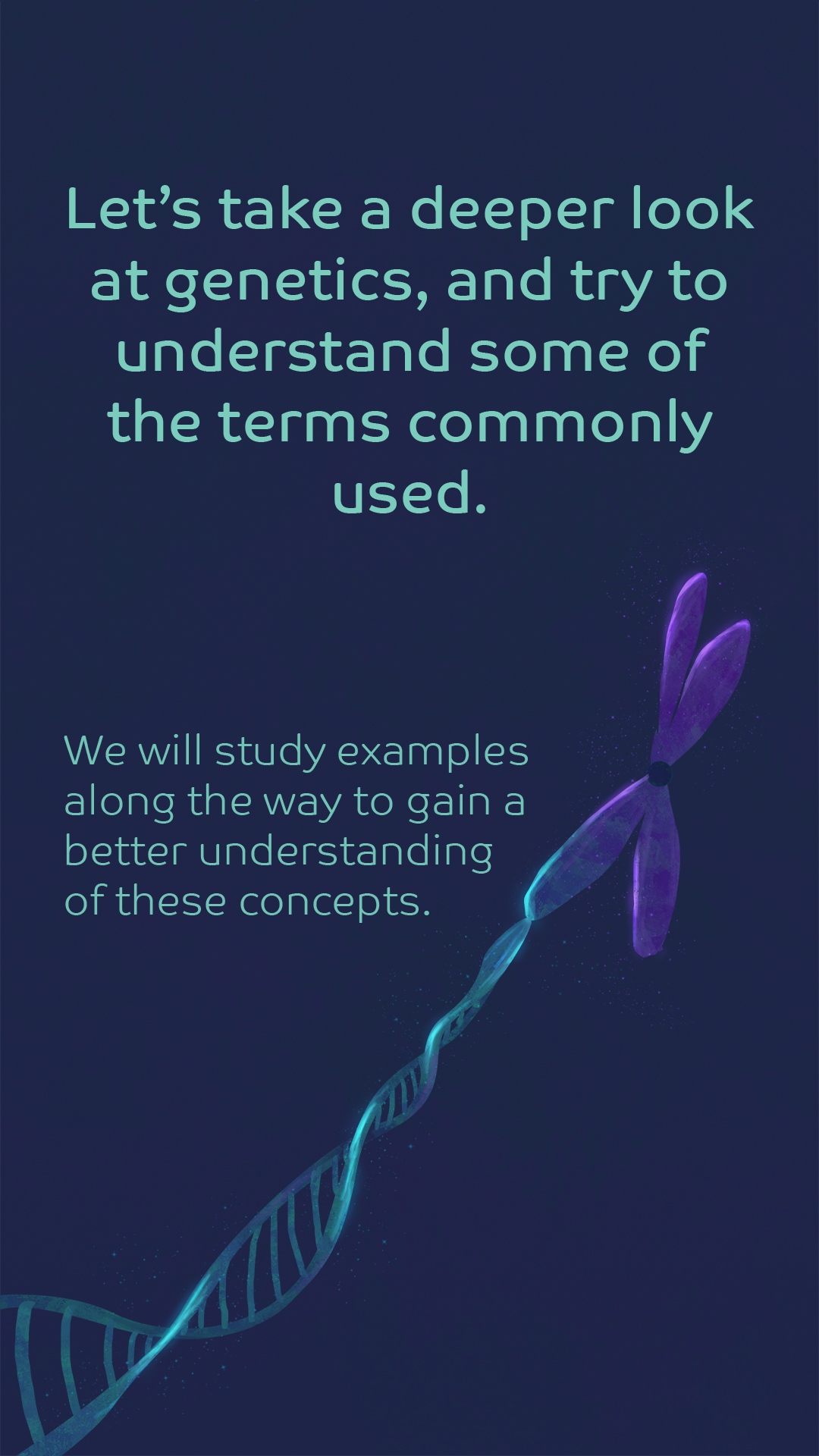
I think I had the most fun making those illustrations that served as covers - the in-betweens with just a topical heading and fancy, glowy lights. They were simple and easy to make because they didn’t have to explain anything, and I had lots of room for showy shapes.
Colour
This one’s tricky - I wanted fancy colours, but I wasn’t sure if keeping them neutral would be a better idea, to keep things at least somewhat scientific. But then I thought that since my illustration style was quite simple and not geared towards realism, I could probably use some leeway when it came to the colours.
I drew major inspiration from this infographic by The Tabletop Whale for the colour scheme. This is a palette I’ve wanted to use forever, and I was overjoyed at the opportunity to finally make use of it. So I played around until I could find a nice, deep blueish purple for the first background, and then graduated it to a pinkish hue throughout the slides, before turning back to blue. I wanted these slight variations just for the fun of it and they really served no practical design purpose.
I chose vibrant colours for each of the elements, as well - and justified them as making them easily readable and clear, but mostly because they look pretty. Look, I love messing with colours, okay? Once I decided that a more toned-down scientific colour palette was not what I was going for, I went all out with them.
Design Style
My style choice for these was based first on ease of painting and next on easy readability. All in all, the two parts were consisting of forty-ish slides - I wanted a style that I could consistently maintain quality on for so many slides without being too slow either. I also needed something quick and easy to understand because I didn’t want people clicking away from the stories due to overly complex illustrations.
Given that I was therefore maintaining very minimalist shapes and designs, I went high on textures, using a textured brush for most of the colours. I opted to keep the interest up by adding lots of dramatic lighting. This served a secondary purpose of making the illustrations read better - bright highlights contrast to darker sections, making them stand out and giving the shapes better definition.
And also, dramatic light is pretty. As are the sparkles which I really didn’t need to add.
Rendering
Last thoughts to cover before I wrap this up: what I discovered when I started rendering.
In my initial sketches, I worked out ideas based on shapes and form a lot. This worked fine mostly, but I neglected to consider that shapes would pop a lot more and be more eye-catching once they had colour. Thus, the overall composition would turn busier than it appeared in simple line sketch. This I discovered when I put in the colours for Slide five, and the composition suddenly did not work.
I mentioned earlier that I had a really complicated design - with the magnifying glass showing the interior of the cell, and all that. I had to scrap those ideas and simplify - dropping the whole zooming-in concept and settling for a very brief look at the cell structure.
This problem I also encountered in the last few slides. I had to tone down and declutter a lot of my initial sketches. Simplicity has been a struggle with these slides, and not just in my illustrations. I struggled with breaking down concepts until they were easy to understand without losing the essence of the topic. Figuring out which bits were okay to gloss over, and which were essential to mention.

I am glad I did go through illustrating all of Part I before moving onto the second part. I had the sketches made for Part II, but now that I have discovered the weak points of my workflow, I can improve the sketches before diving into the rendering, which should hopefully streamline the process some.
And thus, I can conclude my very scattered ramblings on how I made Genetics: Unpack the Jargon - Part I.